Introduction
I am continuing a series of blog posts concerning the COVID-19 crisis that contain some world map visualizations and US State map visualizations of metrics I have found to be useful in analyzing the situation. This week I am also adding some country plots of daily cases over time to see how well certain countries and states are "flattening the curve". COVID-19 is affecting countries all over the world and in many places the number of cases is still growing exponentially everyday. This blog post with the associated Jupyter Notebook will look at different measures of how bad the outbreak is across the world and in the United States. Each metric will be displayed in a global or US choropleth map. Additionally, this exercise sets up repeatable code to use as the crisis continues and more daily data is collected.
Disclaimer
The point of this blog is not to try to develop a model or anything of the sort to detect COVID-19, as a poorly created model could cause more harm than good. This blog is simply to generate visualizations based on publicly available data about COVID-19. These visualizations will ideally help people understand the global effect of COVID-19 and the exponential pace at which cases are developing across the world and in the United States.
Data Sources
As stated in my previous blogs, the data used in this analysis is all publicly available data. The COVID-19 global daily data has been provided from the European Centre for Disease Prevention and Control. This data source is updated daily throughout the crisis and can be used to update this exercise regularly going forward. The US State level COVID-19 data has been made publicly available by the New York Times in a public GitHub Repository. In addition to the COVID-19 data, global and US state population data was used to provide per capita metrics. The global data is from The World Bank, while the US State level population data is from The United States Census Bureau.
Python Code Access
If you are interested in seeing the code used to generate these visualizations, the python code and Jupyter Notebook can be found on GitHub.
Results
To begin, previous blogs can be found here:
- Global Results as of 3/20/20
- Global results as of 3/27/20 and US results as of 3/25/20
- Global results as of 4/10/20 and US results as of 4/9/20
- Global results as of 4/17/20 and US results as of 4/15/20
- Global results as of 4/24/20 and US results as of 4/23/20
- Global results as of 5/1/20 and US results as of 4/29/20
- Global results as of 5/8/20 and US results as of 5/6/20
- Global results as of 5/15/20 and US results as of 5/14/20
As a reminder, the five metrics I will be viewing at both a country level and US state level are the following:
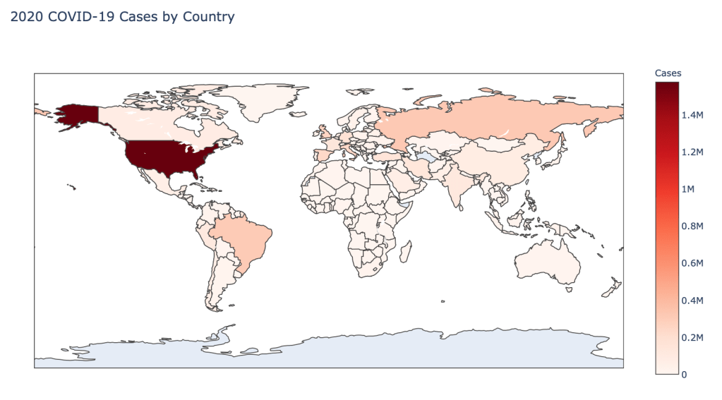
- Number of 2020 Cumulative Cases
- Number of 2020 Cumulative Deaths
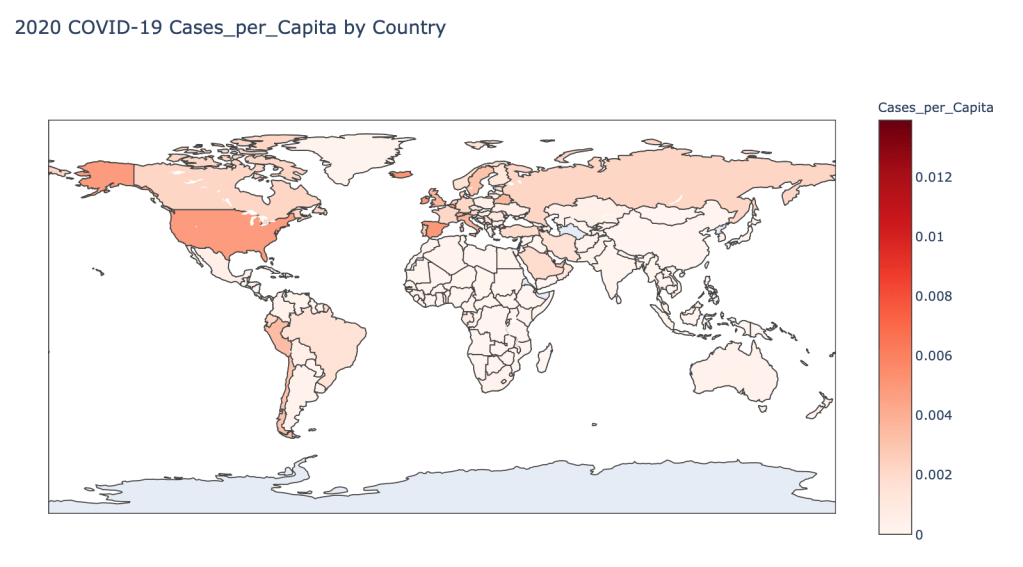
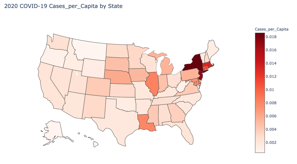
- 2020 Cases per Capita
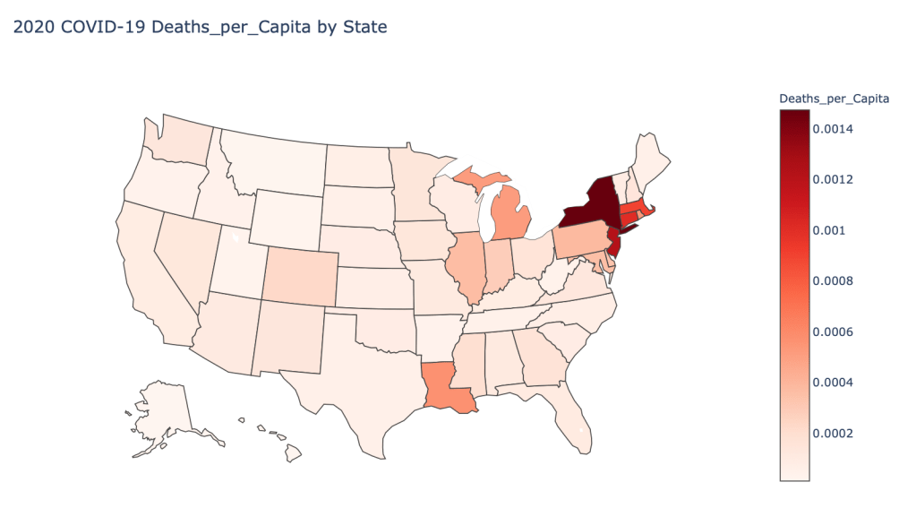
- 2020 Deaths per Capita
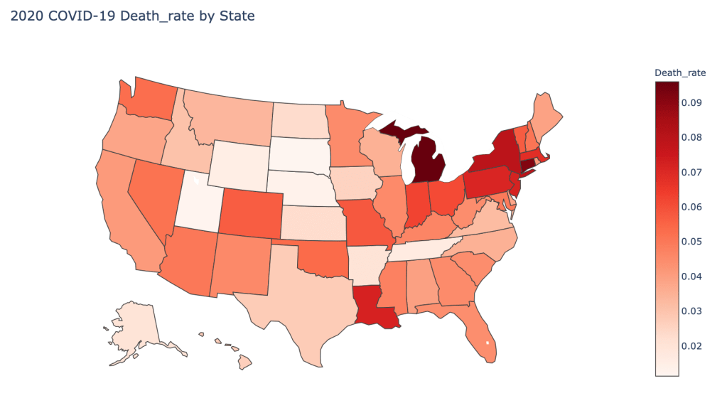
- 2020 Death Rate
In this blog post, the global results are as of 5/22/20, while the US state level results are as of 5/21/20.
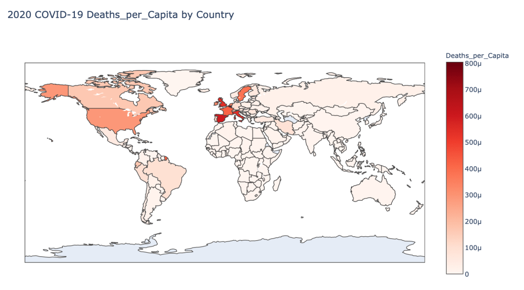
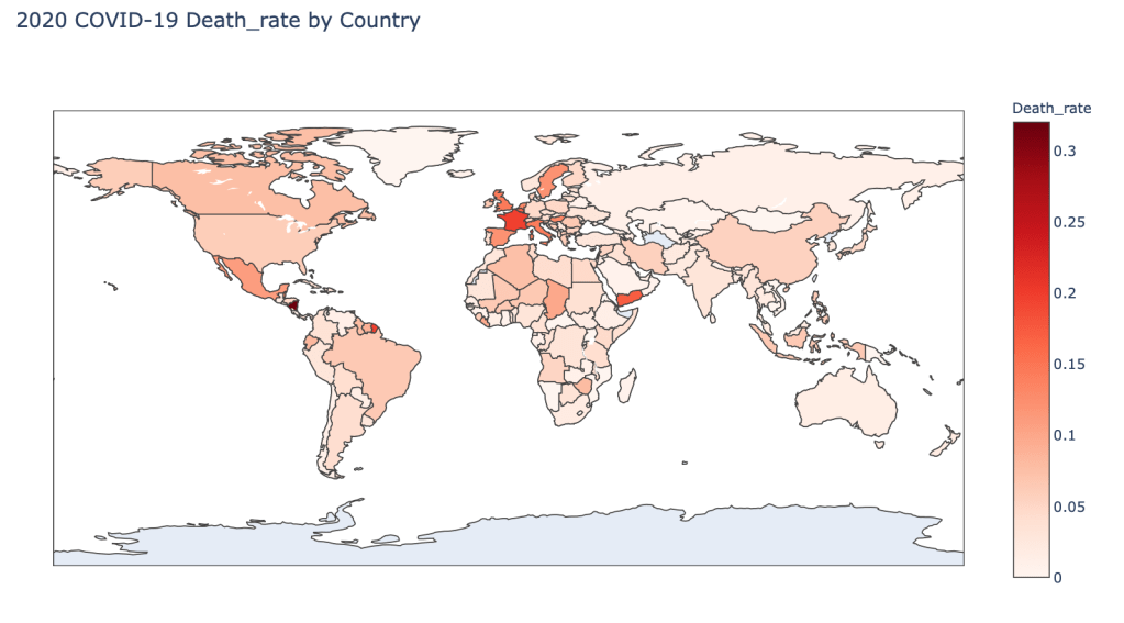
Global Results – 5/22/20
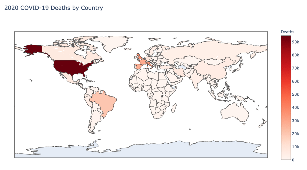
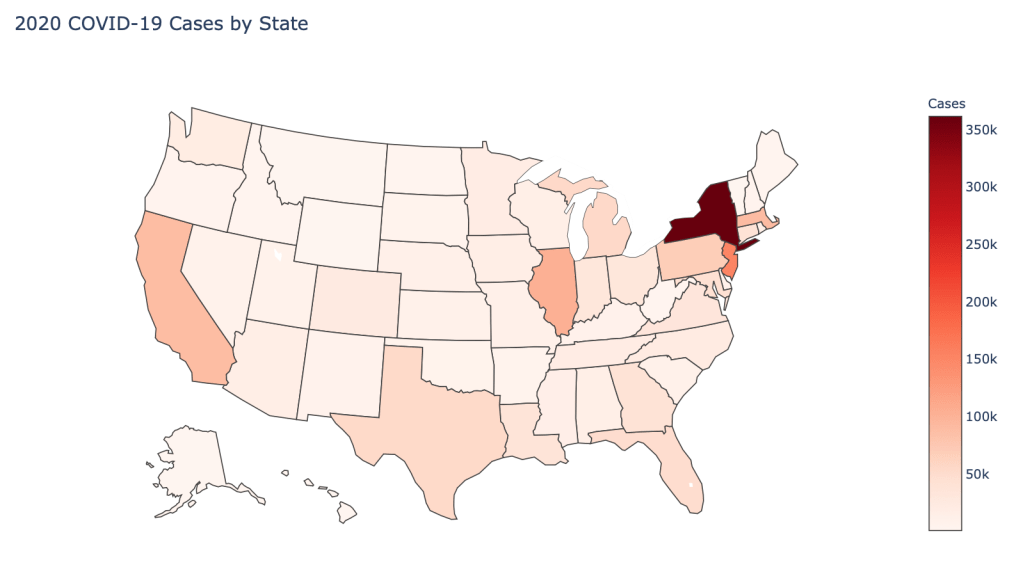
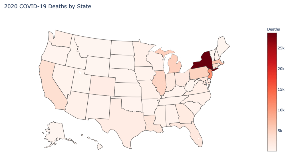
US State Level Results – 5/21/20
Flattening The Curve
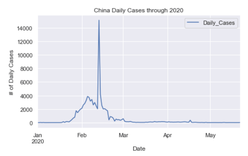
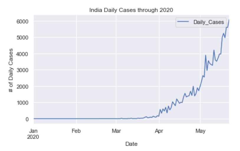
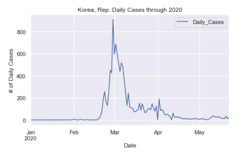
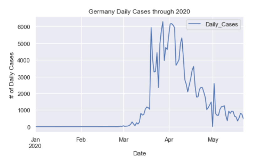
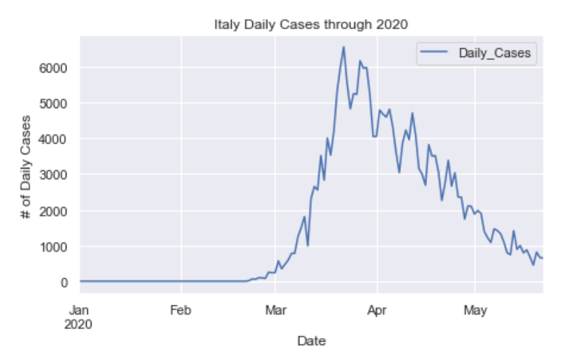
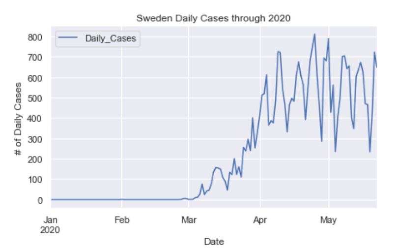
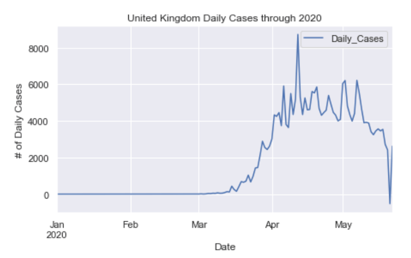
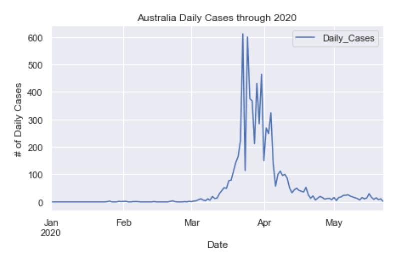
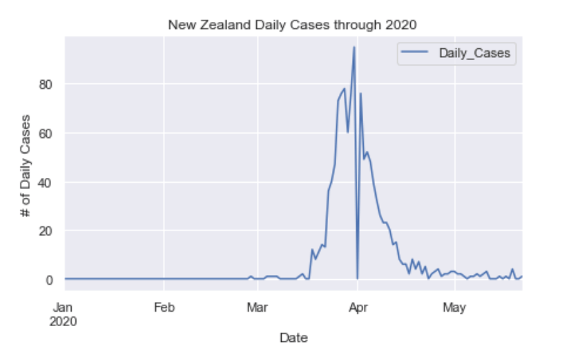
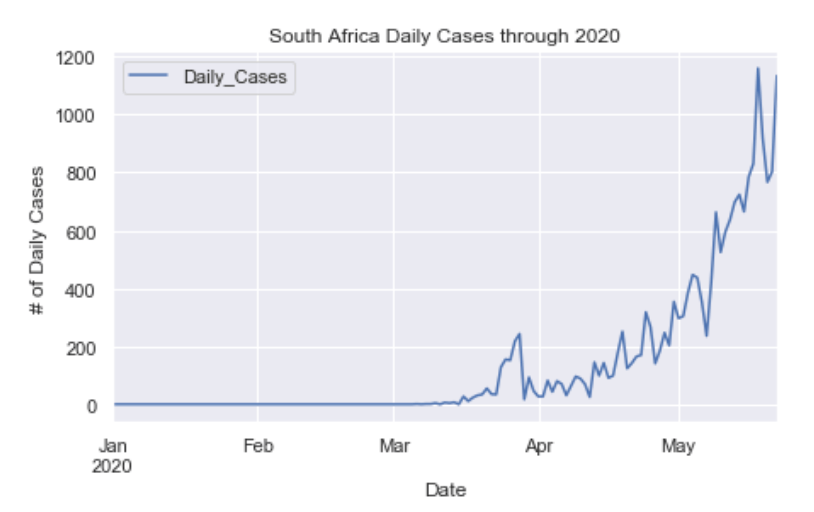
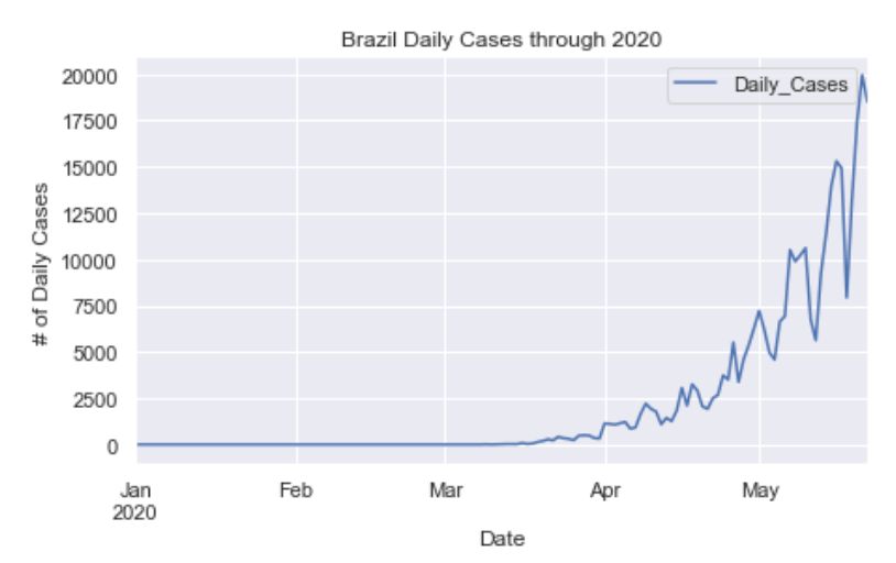
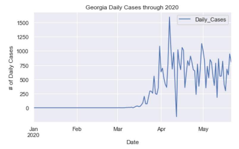
In addition to the global and US state maps, here are some charts of daily cases across the world that show how certain countries and states are faring in terms of flattening the curve. Be sure to pay attention the the scale of these graphs.
Global Results
I’ve selected countries to represent each continent, as well as other countries that have made big headlines in terms of handling COVID very well or very poorly.
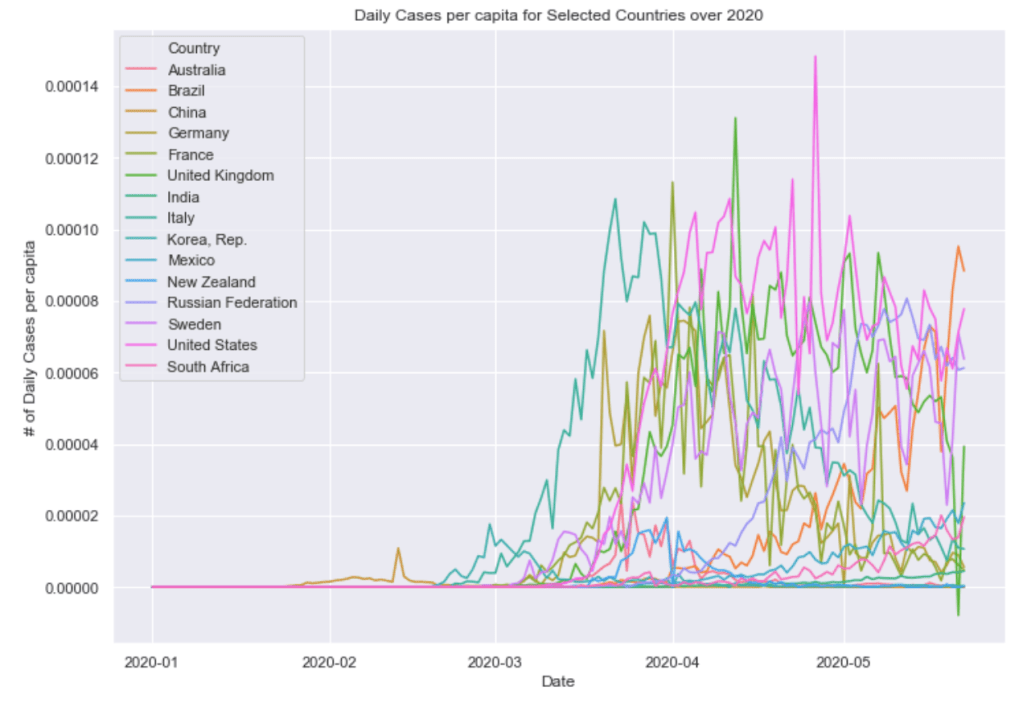
Finally below these graphs are two graphs combining these countries all into a single plot. One of daily cases and one of daily cases per capita. The United States and European countries are doing the worst job of controlling the virus as of now. Recently, Russia and Brazil have been surging in terms of daily cases.
North America


Asia
Europe


Australia/Pacific
Africa
South America
Combined Plots

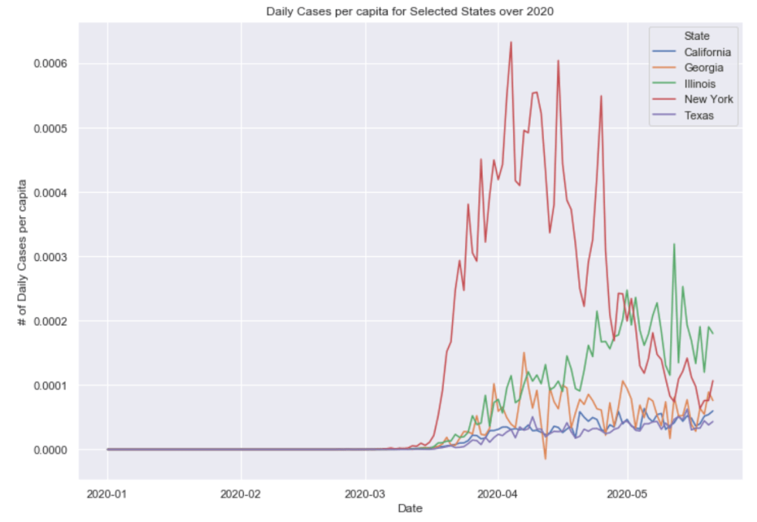
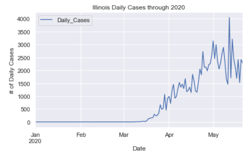
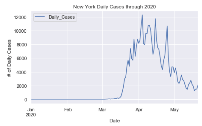
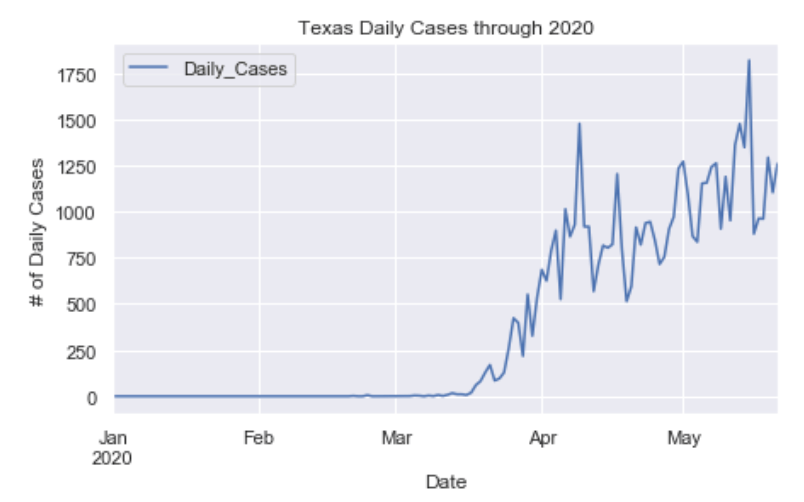
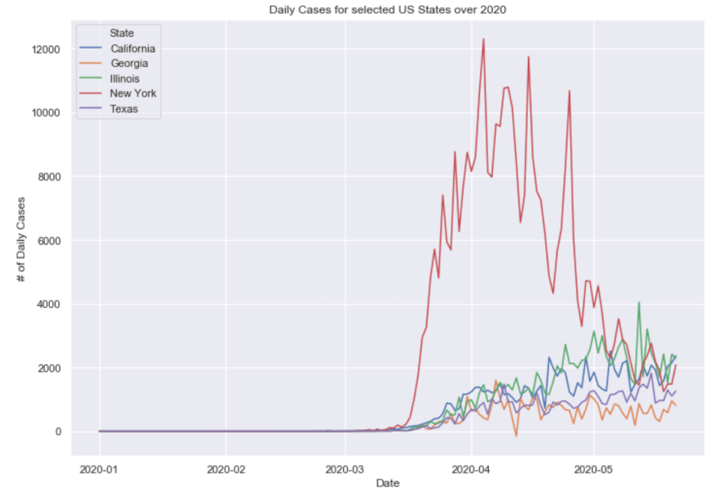
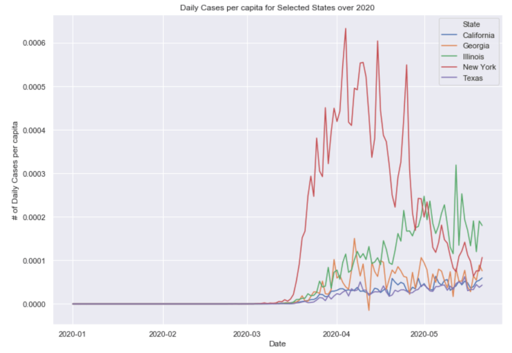
US State Results
I’ve selected five states to represent each region in the US.

Combined Plots
Conclusions
As you can see by looking at the various metrics, certain countries are handling the virus better than others. The United States has the most cases, and in comparison to the overall population, the number of cases is one of the highest percentages in the world. The European countries are also struggling the most in terms of deaths per capita, with the US close behind. Death rates seem to have evened out across the globe as the virus spreads and there are less outliers. European countries seem to have the highest death rates in general, with many hovering above a 10% death rate. France has an astonishing 19.6% death rate currently. Some of these high numbers may have to do with how often tests are administered. Testing only those with intense symptoms, would show a higher death rate. The US is now presenting a 6% death rate and about 0.5% of the population has been confirmed to have the virus.
In the United States, certain states are facing worse COVID circumstances than others. The New York area has been hit the hardest, with both New York and New Jersey having a very high number of cases and deaths. Illinois and California’s overall cases are dramatically on the rise, but this is likely due to increased testing in these states. In addition to the Northeast region, states like Louisiana and Michigan have a lot of deaths per capita. Death rates seem to be fairly evenly spread throughout the states, with Michigan being the highest at 9.6%. The effects of rural states that did not ever go into "shelter in place" is now becoming apparent in cases per capita when looking at Iowa, Nebraska, and South Dakota, all of which have higher infection rates than surrounding rural states.
Many western countries are struggling to flatten the curve, however some, like Germany, have managed to do so. This is likely due to Germany’s aggressive testing of the virus. In the US, New York is really starting to flatten the curve, while Illinois and California are still increasing due to increased testing. Southern states are low in cases, but are in the process of reopening, so the curves may increase again over the coming weeks. Only time will tell.

[…] Global results as of 5/22/20 and US results as of 5/21/20 […]
LikeLike
[…] Global results as of 5/22/20 and US results as of 5/21/20 […]
LikeLike
[…] Global results as of 5/22/20 and US results as of 5/21/20 […]
LikeLike
[…] Global results as of 5/22/20 and US results as of 5/21/20 […]
LikeLike
[…] Global results as of 5/22/20 and US results as of 5/21/20 […]
LikeLike
[…] Global results as of 5/22/20 and US results as of 5/21/20 […]
LikeLike
[…] Global results as of 5/22/20 and US results as of 5/21/20 […]
LikeLike