Global Clean Energy Maps

Maps Using Plotly.Express

Blog Background

I came across a dataset that I thought would be very interesting on the Kaggle Datasets webpage. This dataset includes UN Data about International Energy Statistics. After looking through the dataset a bit with some typical ETL processes, I decided I would compare "clean" and "dirty" energy production in countries across the globe.

ETL

import numpy as np
import pandas as pd
import matplotlib.pyplot as plt
%matplotlib inline

df = pd.read_csv('all_energy_statistics.csv')

df.columns = ['country','commodity','year','unit','quantity','footnotes','category']
elec_df = df[df.commodity.str.contains
                  ('Electricity - total net installed capacity of electric power plants')]

Next Steps

I began by adding up all of the "clean" energy sources, which in this case included (solar, wind, nuclear, hydro, geothermal, and tidal/wave). I created a function to classify the energy types:

def energy_classifier(x):
    label = None
    c = 'Electricity - total net installed capacity of electric power plants, '
    if x == c + 'main activity & autoproducer' or x == c + 'main activity' or x == c + 'autoproducer':
        label = 'drop'
    elif x == c + 'combustible fuels':
        label = 'dirty'
    else:
        label = 'clean'
    return label

Next, I applied this function and dropped the unnecessary rows in the dataset.

elec_df['Energy_Type'] = elec_df.commodity.apply(lambda x: energy_classifier(x))
drop_indexes = elec_df[elec_df.Energy_Type == 'drop'].index
elec_df.drop(drop_indexes, inplace = True)

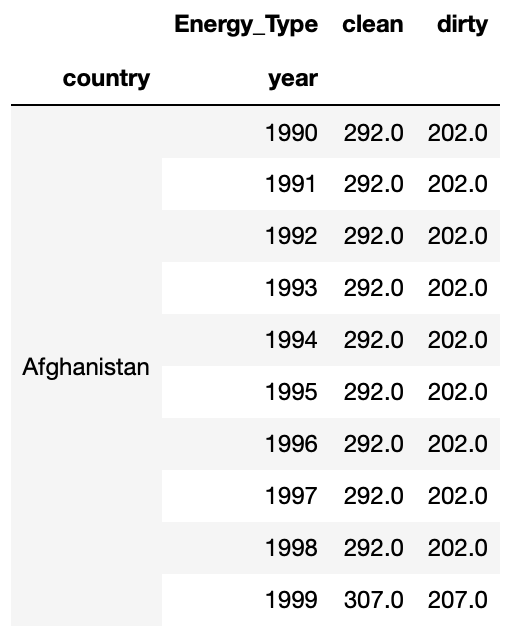
To follow, I pivoted the data into a more useful layout with a sum of energy production for clean and dirty energy.

clean_vs_dirty = elec_df.pivot_table(values = 'quantity', index = ['country', 'year'], columns = 'Energy_Type', aggfunc = 'sum', fill_value = 0)

At this point my data looked like this:

Mapping Prepwork

For simplicity sake, I decided to add a marker of 1 if a country produced more clean energy than dirty energy (otherwise 0). This was accomplished with the following function and application:

def map_marker(df):
    marker = 0
    if df.clean >= df.dirty:
        marker = 1
    else:
        marker = 0
    return marker

clean_vs_dirty['map_marker'] = (clean_vs_dirty.clean >= clean_vs_dirty.dirty)*1

Next, I needed to add the proper codes for the countries that would correspond to mapping codes. I used the Alpha 3 Codes, which can be found here. I imported these codes as a dictionary and applied them to my Dataframe with the following code:

#The following line gives me the country name for every row
clean_vs_dirty.reset_index(inplace = True)

df_codes = pd.DataFrame(clean_vs_dirty.country.transform(lambda x: dict_alpha3[x]))
df_codes.columns = ['alpha3']
clean_vs_dirty['alpha3'] = df_codes

Great! Now I’m ready to map!

Mapping

I wanted to use a cool package I found called plotly.express. It is an easy way to create quick maps. I started with the 2014 map, which I accomplished with the following python code:

clean_vs_dirty_2014 = clean_vs_dirty[clean_vs_dirty.year == 2014]

import plotly.express as px
    
fig = px.choropleth(clean_vs_dirty_2014, locations="alpha3", color="map_marker", hover_name="country", color_continuous_scale='blackbody', title = 'Clean vs Dirty Energy Countries')
fig.show()

This code produced the following map, where blue shaded countries produce more clean energy than dirty energy and black shaded countries produce more energy through dirty sources than clean sources:

You can see here that many major countries, such as the US, China, and Russia were still producing more dirty energy than clean energy in 2014.

Year by Year Maps

As a fun next step, I decided to create a slider using the ipywidgets package to be able to cycle through the years of maps for energy production data. With the following code (and a little manual gif creation at the end) I was able to create the gif map output below, which shows how the countries have changed from 1992 to 2014.

def world_map(input_year):
    
    fig = px.choropleth(clean_vs_dirty[clean_vs_dirty.year == input_year], locations="alpha3", color="map_marker", hover_name="country", color_continuous_scale='blackbody', title = 'Clean vs Dirty Energy Countries')
    fig.show()

import ipywidgets as widgets
from IPython.display import display

year = widgets.IntSlider(min = 1992, max = 2014, value = 1990, description = 'year')

widgets.interactive(world_map, input_year = year)

Success!

I was able to create a meaningful representation of how countries are trending over time. Many countries in Africa, Europe, and South America are making improvements in their clean energy production. However, the US and other major countries were still too reliant on dirty energy as of 2014.

Web Scraping with Beautiful Soup

McDonalds Menu Calorie Counts

Introduction

Have you ever wondered how many calories are in your McDonalds meals? Web scraping can provide an easy way to obtain this information. McDonalds’ website has nutrition information available for all of their main menu items. As a quick exercise, I decided to web scrape the calorie information for every menu item using Python.

Beautiful Soup is a Python library that is very helpful for web scraping. This allows you to pull in the html code and parse through it to get the information you need.

Getting Started

To begin, open the McDonalds’ website menu, I used Google Chrome, and press CMD+OPT+I (Mac). This will bring up the html code of the website for you to inspect.

After inspecting the code to see what tags you need to reference, you can get started in Python with Beautiful Soup.

Import the necessary packages:

import requests
import pandas as pd
from bs4 import BeautifulSoup
import re

Next, use requests to get the html code. Then package the content into a python usable format with Beautiful Soup.

resp = requests.get('https://www.mcdonalds.com/us/en-us/full-menu.html')
soup = BeautifulSoup(resp.content, 'html.parser')

Menu Categories

Now, when looking at the website, you will see that the menu is broken up into different categories as shown below:

In order to cycle through all of the different categories, which each have their own url, you will need to create a list with the proper url links. This is accomplished in the code below:

menu_categories = soup.findAll('a', class_ = 'category-link')
menulinks = [f"https://www.mcdonalds.com{item.attrs['href']}" 
             for item in menu_categories][1:]

F-strings can be very helpful in this type of situation to get the full url. For more information on F-strings, visit the following website.

You can see in the code above that we are finding the ‘a’ tags with class "category-link" and grabbing their attribute ‘href’. This was found from the code inspection in the screenshot above.

Menu Items

Now, that you have a list of menu category urls, it is time to create some functions that will help us obtain the menu item names and calorie counts.

As you can see from the code inspection above, we want to find the ‘a’ tags with class "categories-item-link". You can grab the ‘href’ attribute to get the url for the individual item’s information. Storing this information in a list will allow you to cycle through each item to get the information you need. This is accomplished with the defined functions below:

def get_item_links(menulink):
    resp = requests.get(menulink)
    soup = BeautifulSoup(resp.content, 'html.parser')
    items = soup.findAll('a', class_ = "categories-item-link")
    itemlinks = [f"https://www.mcdonalds.com{item.attrs['href']}" for item in items]
    return itemlinks

Gathering Menu Item Name and Calorie Count

Once you have navigated into an individual item’s webpage, you’ll need to grab the item name and calorie count. You can see in the code inspection below that you will want to grab the ‘h1’ tag with class "heading typo-h1". Using the .get_text() method, you can pull out the name of the item, in this example the Egg McMuffin.

You will also see that the calorie count is shown lower down under the ‘div’ tag with class "calorie-count". Again, we can use the .get_text() method, however this will require a bit of cleaning using regular expressions (re). More information on regular expressions can be found here. These two tasks are accomplished with the following function, which returns a dictionary with the item name as the key and the calorie count as the value.

def get_item_name_and_cal(itemlink):
    resp = requests.get(itemlink)
    soup = BeautifulSoup(resp.content, 'html.parser')
    item_name = soup.find('h1', class_ = "heading typo-h1").get_text()
    calories = soup.find('div', class_ = 'calorie-count').get_text()
    calories = re.sub("\D", "", calories)
    calories = int(calories[:len(calories)//2])
    return {item_name : calories}

Combining Results into a Pandas Dataframe

Now all that is left to do is organize the data into a Pandas Dataframe. This can be accomplished with the following code that loops through the menu categories and item lists.

cals_df = pd.DataFrame()
for link in menulinks:
    itemlinks = get_item_links(link)
    cals_dict = {}
    for link in itemlinks:
        cals_dict.update(get_item_name_and_cal(link))
    cals_df = cals_df.append(pd.DataFrame.from_dict(cals_dict, orient = 'index'))
cals_df.reset_index(inplace = True)
cals_df.columns = ['Item', 'Calories']

This code creates a Pandas Dataframe with 130 menu items and their calorie counts. To look at the head (top 5 rows) of the dataframe, run

cals_df.head()

which will display the following:

Summary Statistics and Exploration

You may want to see some summary statistics, for example, average calories, maximum calories, etc… This can be accomplished by running

cals_df.describe()

which displays:

What Item has the Most Calories?

The item with the most calories can be found with the following line of code:

cals_df.loc[cals_df['Calories'].idxmax()]

This shows that the Big Breakfast® with Hotcakes has the most calories for any individual menu item. Thats a hearty start to the day.

How to Plot a Map in Python

Using Geopandas and Geoplot

Intro

At my previous job, I had to build maps quite often. There was never a particularly easy way to do this, so I decided to put my Python skills to the test to create a map. I ran into quite a few speed bumps along the way, but was eventually able to produce the map I intended to make. I believe with more practice, mapping in Python will become very easy. I originally stumbled across Geopandas and Geoplot for mapping, which I use here, however there are other Python libraries out there that produce nicer maps, such as Folium.

Decide What to Map

First, you have to decide what you would like to map and at what geographical level this information is at. I am interested in applying data science to environmental issues and sustainability, so I decided to take a look at some National Oceanic and Atmospheric Administration (NOAA) county level data for the United States. I specifically chose to look at maximum temperature by month for each county.

Second, you need to gather your data. From the NOAA climate division data website, I was able to pull the data I needed by clicking on the "nClimDiv" dataset link. After unzipping this data into a local folder I was ready to move on for now.

Third, you need to gather a proper Shapefile to plot your data. If you don’t know what a Shapefile is, this link will help to explain their purpose. I was able to retrieve a United States county level Shapefile from the US Census TIGER/Line Shapefile Database. Download the proper dataset and store in the same local folder as the data you want to plot.

Map Prepwork

Shapefile

As mentioned above, I used the python libraries Geopandas and Geoplot. I additionally found that I needed the Descartes libraries installed as well. To install these libraries I had to run the following bash commands from my terminal:

conda install geopandas
conda install descartes
conda install geoplot

Now you will be able to import these libraries as you would with any other python library (e.g. "import pandas as pd"). To load in the Shapefile you can use the following Geopandas (gpd) method:

map_df = gpd.read_file('tl_2017_us_county/tl_2017_us_county.shp')
Data file

To load in the county level data, I had a few more problems to solve. The file came from NOAA in a fixed width file format. For more information on fixed width file formats checkout the following website. I followed these steps to get the data into a workable format:

  • Set the fixed widths into "length" list (provided in fixed width file readme)
length = [2, 3, 2, 4, 7, 7, 7, 7, 7, 7, 7, 7, 7, 7, 7, 7]
  • Read in fixed width file and convert to CSV file using pandas
pd.read_fwf("climdiv-tmaxcy-v1.0.0-20191104", widths=length).to_csv("climdiv-tmaxcy.csv")
  • Load in CSV file without headers
max_temp_df = pd.read_csv('climdiv-tmaxcy.csv', header = None)
  • Create and add column names (provided in fixed width file readme)
max_temp_df.columns = ['Unnamed: 0', 'State_Code', 'Division_Number',
                       'Element_Code', 'Year', 'Jan', 'Feb', 'Mar', 'Apr',
                       'May', 'Jun', 'Jul', 'Aug', 'Sep', 'Oct', 'Nov', 'Dec']
  • Drop unnecessary index column
max_temp_df.drop(columns = ['Unnamed: 0'], inplace = True)

Data Cleaning

Additionally, there was quite a bit of data cleaning involved, but I’ll give you a short overview. I wanted to filter the Shapefile to just be the contiguous United States, so I need to filter out the following state codes:

  • 02: Alaska
  • 15: Hawaii
  • 60: American Samoa
  • 66: Guam
  • 69: Mariana Islands
  • 72: Puerto Rico
  • 78: Virgin Islands
map_df_CONUS = map_df[~map_df['STATEFP'].isin(['02', '66', '15', '72', '78', '69', '60'])]

Let’s take a first look at the Shapefile:

map_df_CONUS.plot(figsize = (10,10))
plt.show()

You can see all the counties in the contiguous United States.

Merging the Shapefile and Dataset

The Shapefile and the Dataset need to have a column in common in order to match the data to map. I decided to match by FIPS codes. To create the FIPS codes in the Shapefile:

map_df_CONUS['FIPS'] = map_df_CONUS.STATEFP + map_df_CONUS.COUNTYFP

To create the FIPS codes in the county data (Note: I filtered the data to only the year 2018 for simplicity):

max_temp_2018_df.State_Code = max_temp_2018_df.State_Code.apply(lambda x : "{0:0=2d}".format(x))

max_temp_2018_df.Division_Number = max_temp_2018_df.Division_Number.apply(lambda x : "{0:0=3d}".format(x))

max_temp_2018_df['FIPS'] = max_temp_2018_df.State_Code + max_temp_2018_df.Division_Number

Finally, to merge the Shapefile and Dataset:

merged_df = map_df_CONUS.merge(max_temp_2018_df, left_on = 'FIPS', right_on = 'FIPS', how = 'left')

Mapping (Finally!)

Finally, we get to map the data to the Shapefile. I used the geoplot.choropleth method to map the maximum temperature data on a scale. The darker the red, the hotter the maximum temperature was for a given county. The map was created for August 2018.

geoplot.choropleth(
    merged_df, hue = merged_df.Aug,
    cmap='Reds', figsize=(20, 20))
plt.title('2018 August Max Temperature by County', fontsize = 20)
plt.show()

Yay!

You can see we were able to plot the data on the county map of the US! I hope this demonstration helps!

Problems

Unfortunately you can see there is missing data. Additionally, I was able to generate a legend, but it would show up as about twice the size of the map itself, so I decided to remove it.