Introduction
I am continuing a series of blog posts concerning the COVID-19 crisis that contain some world map visualizations and US State map visualizations of metrics I have found to be useful in analyzing the situation. COVID-19 is affecting countries all over the world and in many places the number of cases is growing exponentially everyday. This blog post with the associated Jupyter Notebook will look at different measures of how bad the outbreak is across the world and in the United States. Each metric will be displayed in a global or US choropleth map. Additionally, this exercise sets up repeatable code to use as the crisis continues and more daily data is collected.
Disclaimer
The point of this blog is not to try to develop a model or anything of the sort to detect COVID-19, as a poorly created model could cause more harm than good. This blog is simply to generate visualizations based on publicly available data about COVID-19. These visualizations will ideally help people understand the global effect of COVID-19 and the exponential pace at which cases are developing across the world and in the United States.
Data Sources
As stated in my previous blogs, the data used in this analysis is all publicly available data. The COVID-19 global daily data has been provided from the European Centre for Disease Prevention and Control. This data source is updated daily throughout the crisis and can be used to update this exercise regularly going forward. The US State level COVID-19 data has been made publicly available by the New York Times in a public GitHub Repository. In addition to the COVID-19 data, global and US state population data was used to provide per capita metrics. The global data is from The World Bank, while the US State level population data is from The United States Census Bureau.
Python Code Access
If you are interested in seeing the code used to generate these visualizations, the python code and Jupyter Notebook can be found on GitHub.
Results
To begin, previous blogs can be found here:
- Global Results as of 3/20/20
- Global results as of 3/27/20 and US results as of 3/25/20
- Global results as of 4/10/20 and US results as of 4/9/20
- Global results as of 4/17/20 and US results as of 4/15/20
- Global results as of 4/24/20 and US results as of 4/23/20
As a reminder, the five metrics I will be viewing at both a country level and US state level are the following:
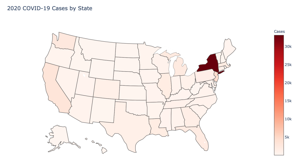
- Number of 2020 Cumulative Cases
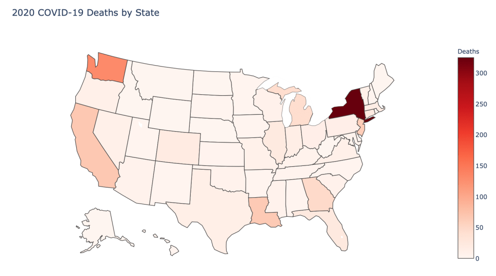
- Number of 2020 Cumulative Deaths
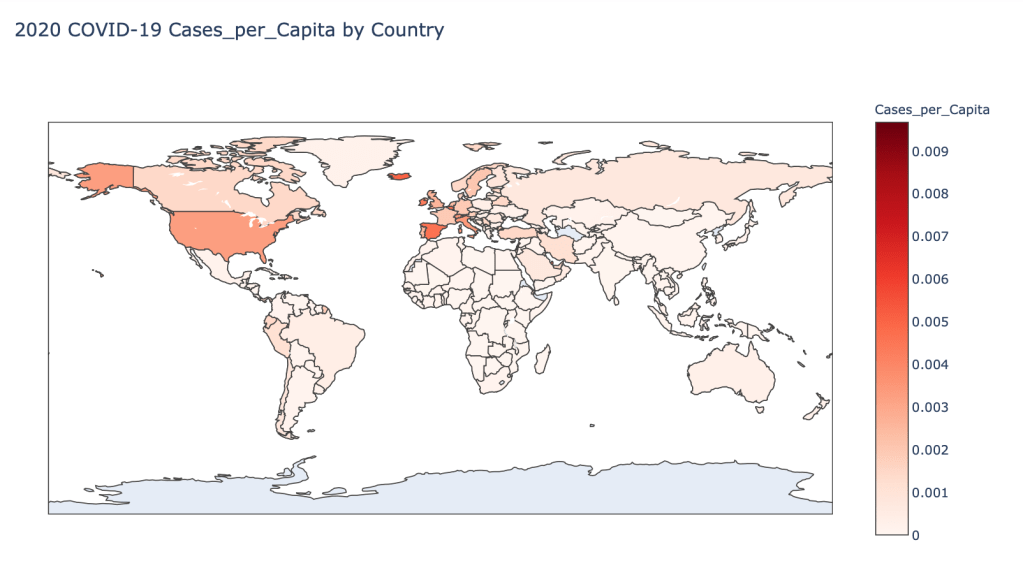
- 2020 Cases per Capita
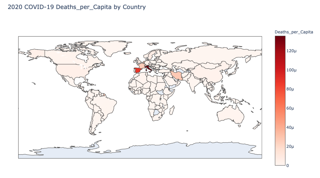
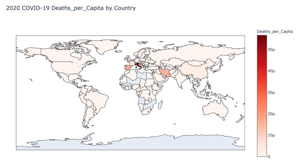
- 2020 Deaths per Capita
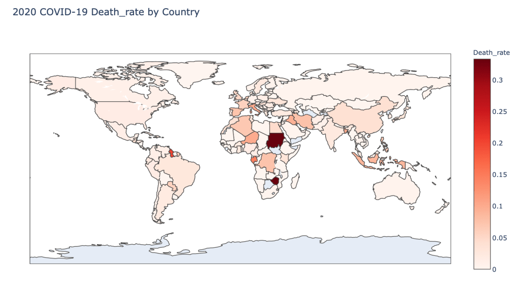
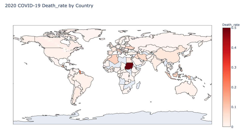
- 2020 Death Rate
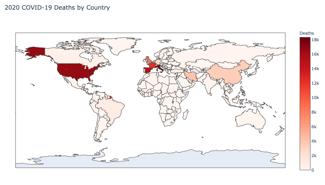
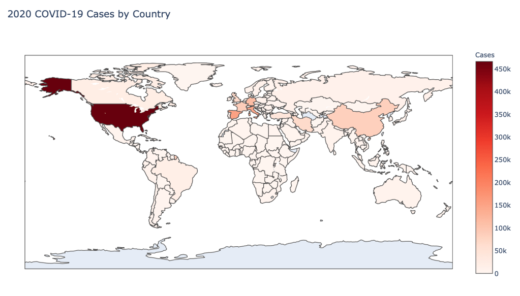
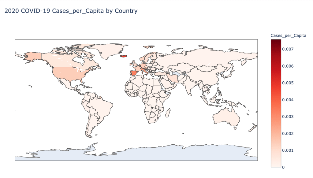
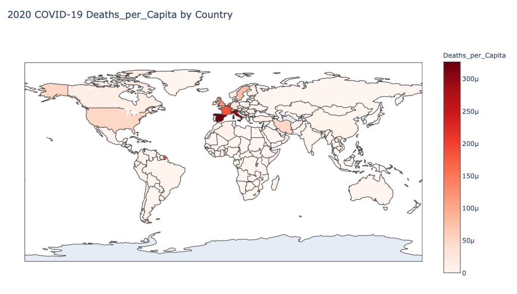
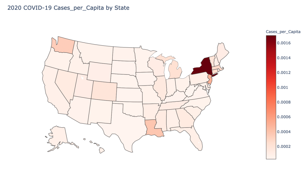
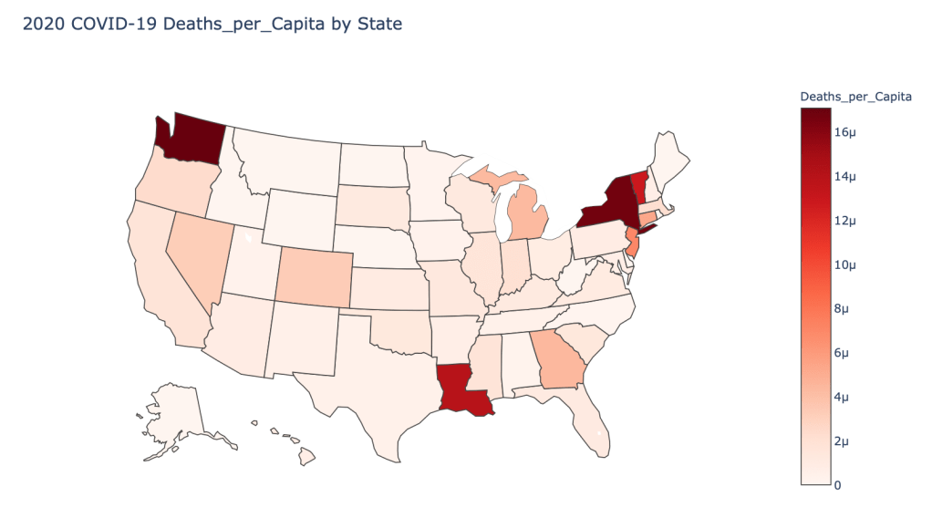
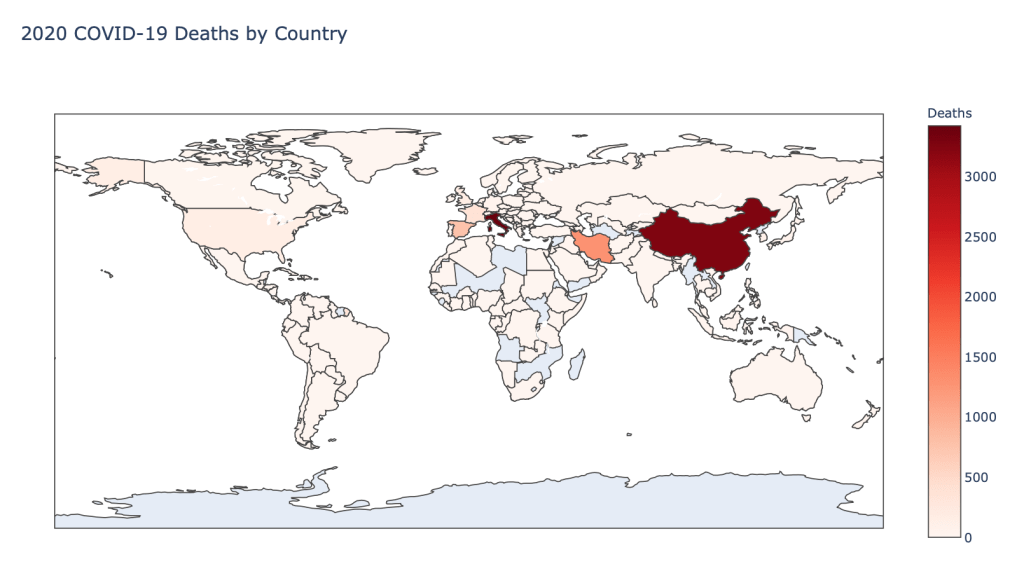
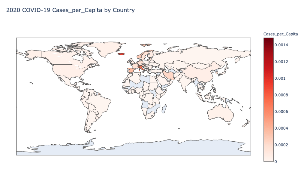
In this blog post, the global results are as of 5/1/20, while the US state level results are as of 4/29/20.
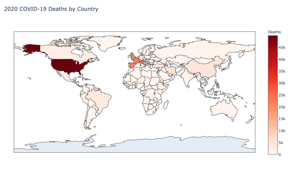
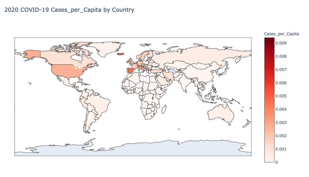
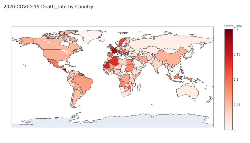
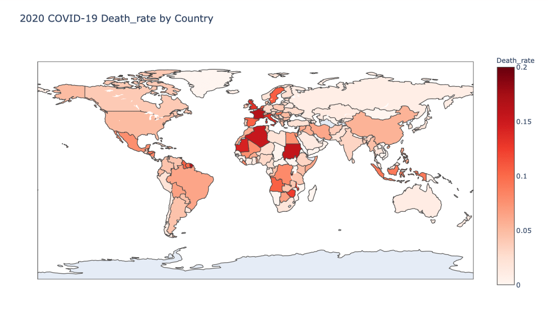
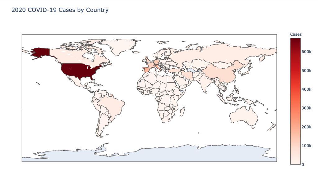
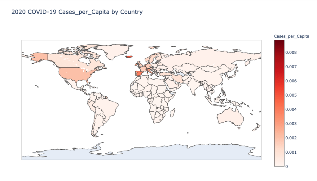
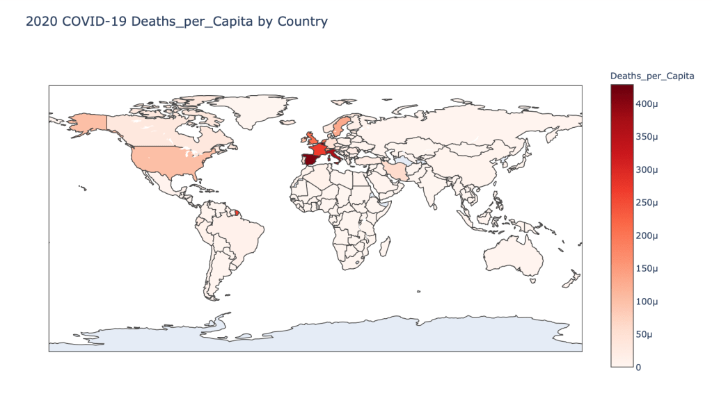
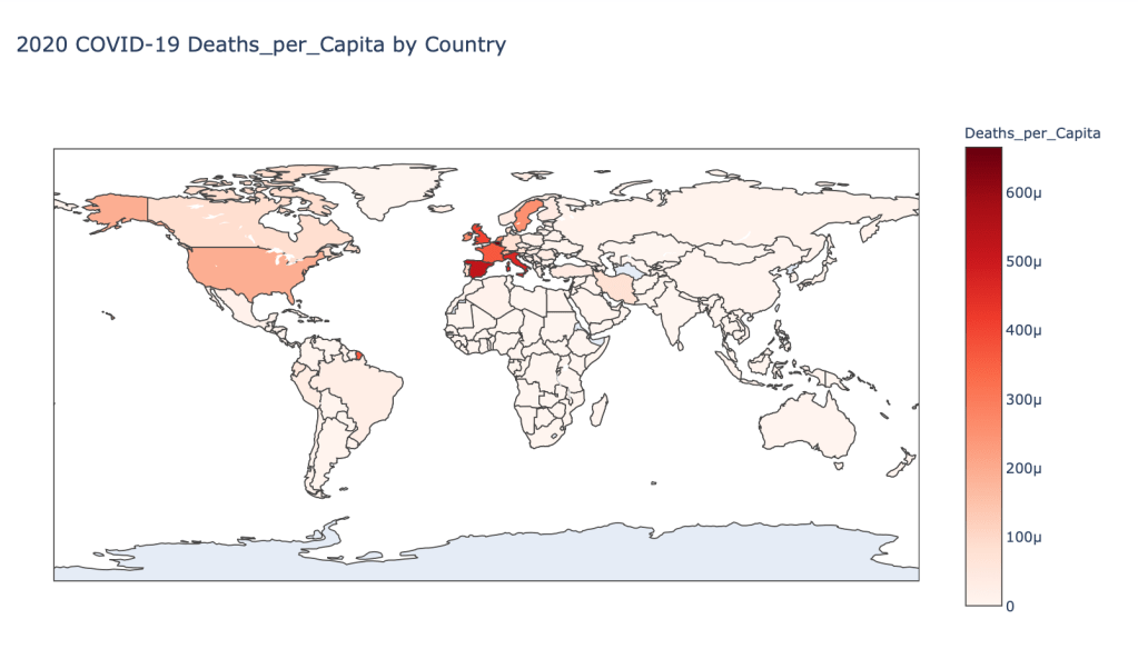
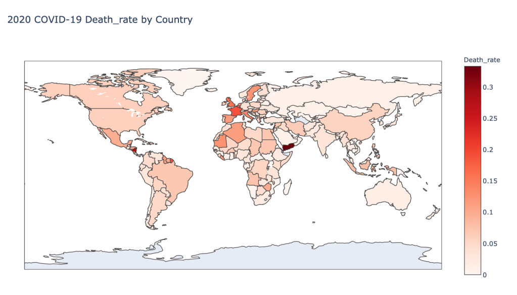
Global Results – 5/1/20


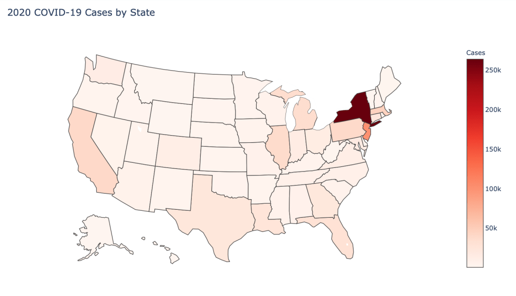
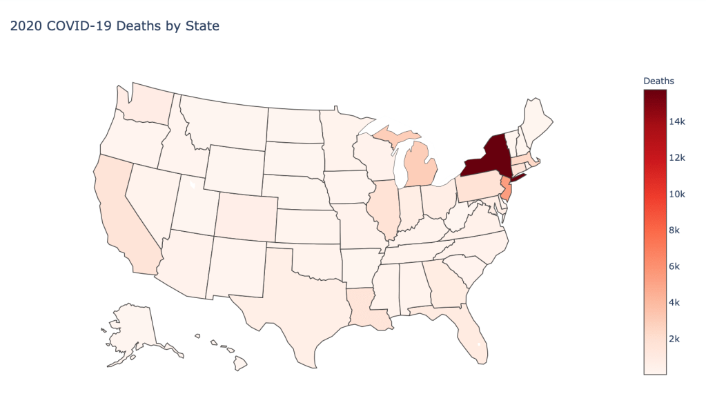
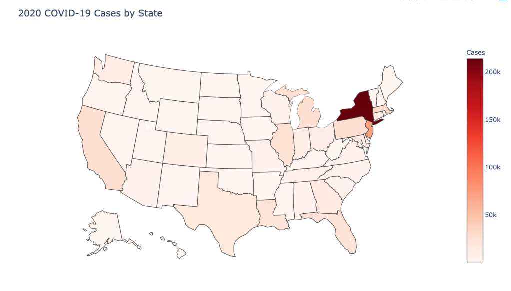
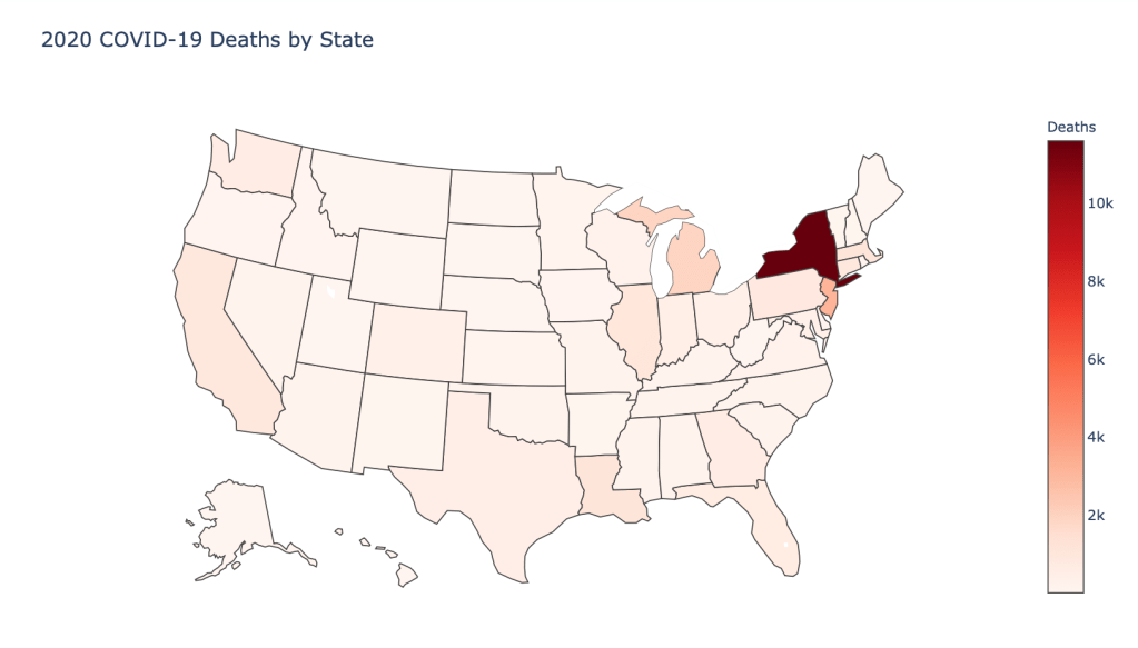
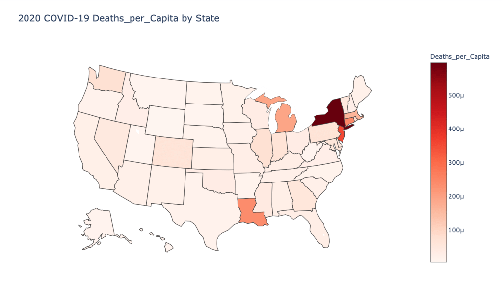
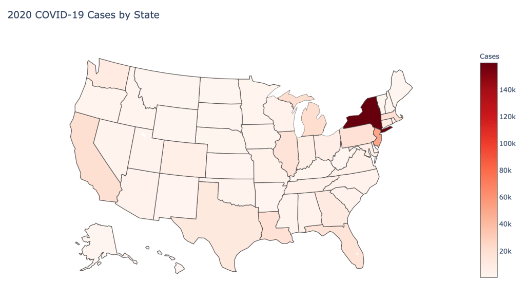
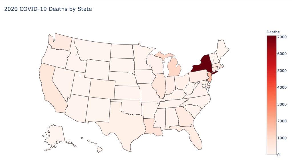
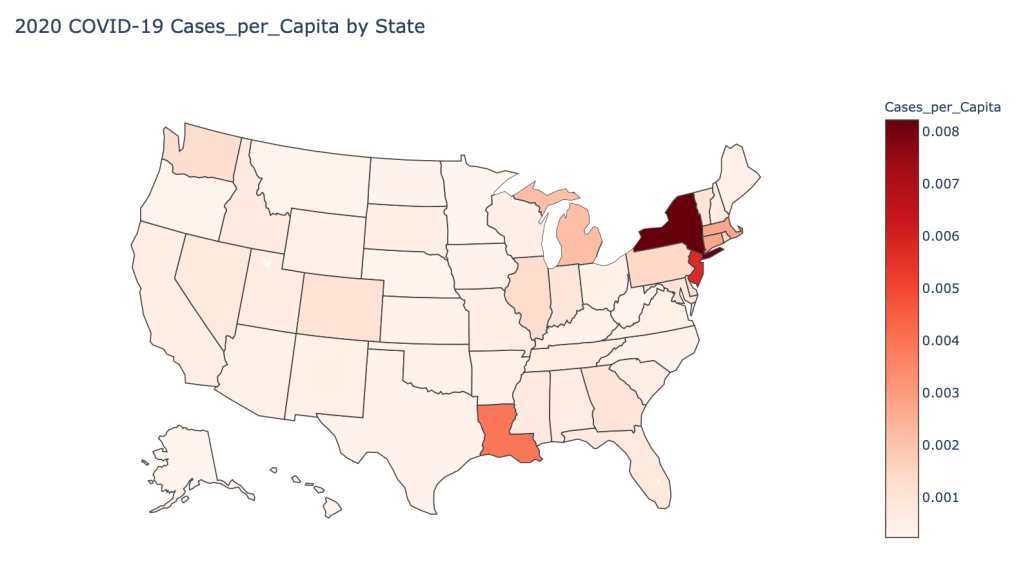
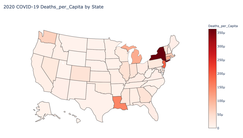
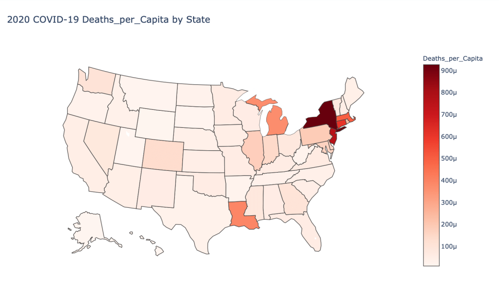
US State Level Results – 4/29/20


Conclusions
As you can see by looking at the various metrics, certain countries are handling the virus better than others. The United States has the most cases, and in comparison to the overall population, the number of cases is about as high as those of some European countries. The European countries are also struggling the most in terms of deaths per capita, with the US close behind. Death rates seem to have evened out across the globe as the virus spreads and there are less outliers. European countries seem to have the highest death rates in general, with many hovering above a 10% death rate. France has an astonishing 18.8% death rate currently. Some of these high numbers may have to do with how often tests are administered. Testing only those with intense symptoms, would show a higher death rate.
In the United States, certain states are facing worse COVID circumstances than others. The New York area has been hit the hardest, with both New York and New Jersey having a very high number of cases and deaths. In addition to the Northeast region states like Louisiana and Michigan have a lot of deaths per capita. Death rates seem to be fairly evenly spread throughout the states, with Michigan being the highest at 9%.