Batch Github Repository Deletion

The Bootcamp Unwanted Repo Struggle

As a student in the Flatiron School Data Science Immersive Program in Chicago, I have encountered a problem that I believe many other tech bootcamp students have likely encountered: Hundreds of unwanted Github repositories. This problem came about because of the many online labs we have to complete as students. Anytime a repository is cloned in order to work on the lab locally, it creates a new repository on your Github account. As I am approaching the beginning of my career search, I wanted to clean up my Github page for potential employers to view. These employers will not want to have to search through 200+ repos in order to find the five repos I actually want them to see. Unfortunately, in order to delete a single repository on Github it requires clicking through about three pages, manually typing in the exact repository name you want to delete, and clicking again to finally delete. So you can see how this would get tiresome after about five repos. I wanted to find a way to automate this process to save myself the trouble.

Finding a Solution

Through the course of my internet searching for a solution, I came across this blog by a former Flatiron student facing the same problem. The blog, by Colby Pines, explains a solution to this problem using a Github API key and a bash function. I followed this blog, and it worked out great, but it left out some key steps/explanations, so I wanted to expand on the idea.

Cleaning your Github Page

Here are some steps to follow to clean out unwanted repos:

  1. Get a Github API token (Settings -> Developer settings -> Personal Access Tokens -> Generate New Token)
    • Be sure to enter in a Note
    • Check the repo and delete_repo boxes under "Select Scopes"
    • Generate Token
    • At this point you will get an API token. Be sure to copy this to a file so you don’t lose it
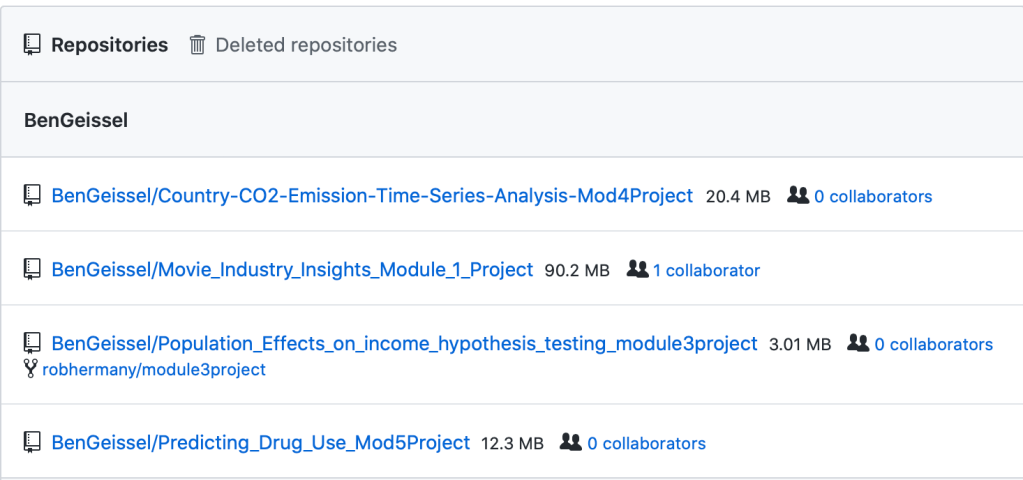
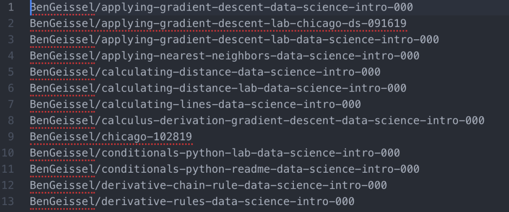
  2. Copy all your repos (Settings -> Repositories) and paste them into your favorite text editor (I use Atom)
    • The Repositories page should look something like the following. You can copy all of the list out into your text editor
  1. Use regex to filter the list down to just the ones you DO NOT want
    • This site shows how to use regex with Atom
    • I first searched for rows with learn-co (this is where Flatiron repos come from) and deleted these rows
    • I next used Colby’s regex example for getting rid of all information after the repo name (each is followed by whitespace and size, collaborator information): %s/\s.*$//g
  2. At this point, you should be left with a list of repo names that you DO NOT want, separated by a new line. Save this file somewhere easy to access and name it unwanted_repos.txt (so you can remember what it is)
    • The file should look something like this:
  1. Now we will shift to the terminal/command line. I use a Mac and utilize my bash profile for reference. First, you will want to find your bash profile by going to your root directory and opening up the bash profile with a text editor. I did this with the following code:
cd ~
atom .bash_profile
  1. Once in the bash profile we can add the following function that Colby created:
function git_repo_delete(){
  curl -vL \
  -H "Authorization: token YOUR_API_TOKEN_HERE" \
  -H "Content-Type: application/json" \
  -X DELETE https://api.github.com/repos/$1 \
  | jq .
}

In the above code, the $1 represents the unwanted repository name that will be inputed when the function is run.

NOTE: If the "jq" portion of this code does not work for you, brew install this through your terminal

brew install jq
  1. Once the function is saved in your bash profile you’ll be ready to run the final lines of code. In order for the function to work though, you’ll have to quit your terminal and restart it. Putting the function in the bash profile works because your terminal automatically sources the information in the bash profile when it starts up. If you want to put the function somewhere else, you will have to manually source that file after you save the function.
  2. After restarting your terminal (or sourcing your function from another file) you can run the following two lines of code:
repos=$( cat ~/Desktop/unwanted_repos.txt) 
for repo in $repos; do (git_repo_delete "$repo"); done
  1. Make sure to change the path in the first line of code to where your unwanted repos list is saved.
  2. Once the second line of code is run, your terminal will iteratively delete each repo from your Github page. Check your Github page to make sure you now only have the repos you wanted left

Hope this helps! Thanks Colby for the original run through of this process!

Predicting Drug Use with Logistic Regression

Introduction

This project began as a search for classification problems to tackle. I wanted to put my classification algorithm skills to the test, but wasn’t sure what data to use for this. Luckily, after digging around on the internet for a while, I came across the UC Irvine Machine Learning Data Repository. This repository has loads of datasets and even has a feature, "Default Task", that you can toggle in order to find the common machine learning task that would be applied to a given dataset. When looking through the Classification datasets I found a dataset regarding drug use that looked interesting. The dataset was originally collected by Elaine Fehrman, Vincent Egan, and Evgeny M. Mirkes in 2015.

This dataset provides 1885 data rows, each of which represents a person. Each person has a set of demographic and personality traits alongside a set of drug use responses. Data features included things like age, ethnicity, education level, country, extraversion score, openness to new experiences score, etc… The dataset looks at 17 common drugs (including chocolate??) and how recently someone has used each of the drugs. I decided to make drug use a binary outcome by grouping no usage ever and usage over a decade ago into "non user" and all other outcomes into "user", meaning that the person has used the drug within the last decade.

At this point I decided I would use Logistic Regression to predict whether or not a person was a user of each of the 17 drugs given in the dataset. This model information could help to determine which types of people are more susceptible to certain types of drug use given their personality type and demographic traits. This information could then be used to give treatment and assistance to those who require it.

ETL

After importing the necessary libraries and loading in the dataset into a Pandas DataFrame, the raw data looks like this:

You can see that the data comes in a very weird format, but luckily there are descriptions on the data webpage. Using these descriptions, I transformed the data into a more coherent DataFrame.

Dummy Variables and Checks for Multicollinearity

After getting the data into a useful format, I needed to deal with my categorical variables. I fit dummy variables to all of them and made sure to drop one of the resulting columns. I also needed to check if any of my numeric features had multicollinearity. As you can see in the seaborn pairplot below, the only two metrics that appear to have any multicollinearity are neuroticism and extraversion, but the correlation level is below .75, so I kept both scores in the DataFrame.

DataFrame Splitting

After a little more data manipulation (changing the column order), I needed to create separate DataFrames for each drug. I decided to store each of these in a dictionary, with each key being a name for the drug DataFrame and the value being the corresponding DataFrame. This was accomplished with the chunk of code below:

Note: The above portion of the code with df.iloc[:, :34] isolates the portion of the DataFrame corresponding to the features. After column 34 are the binary drug use columns.

Helper Functions for Model Fitting

First things first, I need to import the proper libraries and functions for all the tools I’ll need for my Logistic Regression process.

A quick note on the scikitplot library. This library has many awesome functions for calculating metrics and plotting them in one step. You’ll see a use of this for confusion matrices later on.

In order to loop through my new dictionary and fit a Logistic Regression model to each DataFrame, I needed to define a few helper functions. The first function will split the DataFrame into the features and the target, X and y respectively.

The next helper function will perform standard scaling on my numeric features after I have performed a train/test split on my data.

An additional helper function I wrote performs SMOTE on the datasets. Many of the drug user datasets are very unbalanced, so in order to train my model on a balanced dataset, I need to use SMOTE to synthetically create training data points for my minority class. This function is created below.

Another useful step in Logistic Regression is using a grid search for the best performing hyperparameters C and Penalty type. These control regularization of the models and this function will output the optimized hyperparameters for each drug use model.

Finally, one last helper function. This is the function that actually fits the Logistic Regression model and creates output metrics and visualizations. This model takes in the train/test split data and the optimized hyperparameters C and Penalty type. The function when applied will create visualizations for the confusion matrix and ROC Curve. It also outputs the test sample’s class balance, which helps to inform how the test data is distributed.

Fitting the Model

Finally, it is time to fit all of the models and view the results. I wrote one last function which combines all of the above functions into one simple function that can be applied to a single DataFrame.

This function is then applied to each DataFrame in my previously created dictionary with a for loop to generate all of the necessary model results and visualizations.

Results

As there were 17 different drugs in question, I will only highlight a few of the results below. The Logistic Regression model performed well in most cases, although those with extremely unbalanced datasets performed slightly worse despite the use of SMOTE to balance the training sets.

Alcohol

Alcohol had an extremely unbalanced dataset. You can see that 96% of the test group had used alcohol. Alcohol did produce a large number of false negatives, however the F1 Score and AUC metrics signaled that this was a decent model.

Cannabis

Cannabis had a more balanced dataset than alcohol, with 67% of the test group having used the drug. The Logistic Regression for Cannabis use was able to generate both a high F1 Score and high AUC.

Nicotine

Nicotine also had a more balanced dataset than alcohol, with 67% of the test group having used Nicotine. Similarly to Cannabis, the Logistic Regression model for Nicotine was able to produce both a high F1 Score and a high AUC.

Meth

Finally, I’ll look at a drug that has an unbalanced dataset in the other direction. Obviously not a ton of people use Meth, although more than I imagined, with 24% of the test group having used Meth before. The Logistic Regression for Meth use produced a fair amount of false positives. Additionally the metrics and F1 Score are fairly low. The ROC Curve and AUC show decent results, but in the case of an unbalanced dataset, I would trust F1 Score over AUC.

Conclusions

I was able to fit a Logistic Regression model to each of the drug use DataFrames, however for some of the drugs, Logistic Regression may not be the best choice classifier model. Since a lot of the datasets are unbalanced, this did cause some issues with the metrics.

Overall, the results were very good and could help to inform us about an individual’s drug use given information about their demographic traits and personality traits.

Just for Curiosity

Here is a bar chart of drug use percentage for all 1885 people in the dataset.

Global Clean Energy Maps

Maps Using Plotly.Express

Blog Background

I came across a dataset that I thought would be very interesting on the Kaggle Datasets webpage. This dataset includes UN Data about International Energy Statistics. After looking through the dataset a bit with some typical ETL processes, I decided I would compare "clean" and "dirty" energy production in countries across the globe.

ETL

import numpy as np
import pandas as pd
import matplotlib.pyplot as plt
%matplotlib inline

df = pd.read_csv('all_energy_statistics.csv')

df.columns = ['country','commodity','year','unit','quantity','footnotes','category']
elec_df = df[df.commodity.str.contains
                  ('Electricity - total net installed capacity of electric power plants')]

Next Steps

I began by adding up all of the "clean" energy sources, which in this case included (solar, wind, nuclear, hydro, geothermal, and tidal/wave). I created a function to classify the energy types:

def energy_classifier(x):
    label = None
    c = 'Electricity - total net installed capacity of electric power plants, '
    if x == c + 'main activity & autoproducer' or x == c + 'main activity' or x == c + 'autoproducer':
        label = 'drop'
    elif x == c + 'combustible fuels':
        label = 'dirty'
    else:
        label = 'clean'
    return label

Next, I applied this function and dropped the unnecessary rows in the dataset.

elec_df['Energy_Type'] = elec_df.commodity.apply(lambda x: energy_classifier(x))
drop_indexes = elec_df[elec_df.Energy_Type == 'drop'].index
elec_df.drop(drop_indexes, inplace = True)

To follow, I pivoted the data into a more useful layout with a sum of energy production for clean and dirty energy.

clean_vs_dirty = elec_df.pivot_table(values = 'quantity', index = ['country', 'year'], columns = 'Energy_Type', aggfunc = 'sum', fill_value = 0)

At this point my data looked like this:

Mapping Prepwork

For simplicity sake, I decided to add a marker of 1 if a country produced more clean energy than dirty energy (otherwise 0). This was accomplished with the following function and application:

def map_marker(df):
    marker = 0
    if df.clean >= df.dirty:
        marker = 1
    else:
        marker = 0
    return marker

clean_vs_dirty['map_marker'] = (clean_vs_dirty.clean >= clean_vs_dirty.dirty)*1

Next, I needed to add the proper codes for the countries that would correspond to mapping codes. I used the Alpha 3 Codes, which can be found here. I imported these codes as a dictionary and applied them to my Dataframe with the following code:

#The following line gives me the country name for every row
clean_vs_dirty.reset_index(inplace = True)

df_codes = pd.DataFrame(clean_vs_dirty.country.transform(lambda x: dict_alpha3[x]))
df_codes.columns = ['alpha3']
clean_vs_dirty['alpha3'] = df_codes

Great! Now I’m ready to map!

Mapping

I wanted to use a cool package I found called plotly.express. It is an easy way to create quick maps. I started with the 2014 map, which I accomplished with the following python code:

clean_vs_dirty_2014 = clean_vs_dirty[clean_vs_dirty.year == 2014]

import plotly.express as px
    
fig = px.choropleth(clean_vs_dirty_2014, locations="alpha3", color="map_marker", hover_name="country", color_continuous_scale='blackbody', title = 'Clean vs Dirty Energy Countries')
fig.show()

This code produced the following map, where blue shaded countries produce more clean energy than dirty energy and black shaded countries produce more energy through dirty sources than clean sources:

You can see here that many major countries, such as the US, China, and Russia were still producing more dirty energy than clean energy in 2014.

Year by Year Maps

As a fun next step, I decided to create a slider using the ipywidgets package to be able to cycle through the years of maps for energy production data. With the following code (and a little manual gif creation at the end) I was able to create the gif map output below, which shows how the countries have changed from 1992 to 2014.

def world_map(input_year):
    
    fig = px.choropleth(clean_vs_dirty[clean_vs_dirty.year == input_year], locations="alpha3", color="map_marker", hover_name="country", color_continuous_scale='blackbody', title = 'Clean vs Dirty Energy Countries')
    fig.show()

import ipywidgets as widgets
from IPython.display import display

year = widgets.IntSlider(min = 1992, max = 2014, value = 1990, description = 'year')

widgets.interactive(world_map, input_year = year)

Success!

I was able to create a meaningful representation of how countries are trending over time. Many countries in Africa, Europe, and South America are making improvements in their clean energy production. However, the US and other major countries were still too reliant on dirty energy as of 2014.

Web Scraping with Beautiful Soup

McDonalds Menu Calorie Counts

Introduction

Have you ever wondered how many calories are in your McDonalds meals? Web scraping can provide an easy way to obtain this information. McDonalds’ website has nutrition information available for all of their main menu items. As a quick exercise, I decided to web scrape the calorie information for every menu item using Python.

Beautiful Soup is a Python library that is very helpful for web scraping. This allows you to pull in the html code and parse through it to get the information you need.

Getting Started

To begin, open the McDonalds’ website menu, I used Google Chrome, and press CMD+OPT+I (Mac). This will bring up the html code of the website for you to inspect.

After inspecting the code to see what tags you need to reference, you can get started in Python with Beautiful Soup.

Import the necessary packages:

import requests
import pandas as pd
from bs4 import BeautifulSoup
import re

Next, use requests to get the html code. Then package the content into a python usable format with Beautiful Soup.

resp = requests.get('https://www.mcdonalds.com/us/en-us/full-menu.html')
soup = BeautifulSoup(resp.content, 'html.parser')

Menu Categories

Now, when looking at the website, you will see that the menu is broken up into different categories as shown below:

In order to cycle through all of the different categories, which each have their own url, you will need to create a list with the proper url links. This is accomplished in the code below:

menu_categories = soup.findAll('a', class_ = 'category-link')
menulinks = [f"https://www.mcdonalds.com{item.attrs['href']}" 
             for item in menu_categories][1:]

F-strings can be very helpful in this type of situation to get the full url. For more information on F-strings, visit the following website.

You can see in the code above that we are finding the ‘a’ tags with class "category-link" and grabbing their attribute ‘href’. This was found from the code inspection in the screenshot above.

Menu Items

Now, that you have a list of menu category urls, it is time to create some functions that will help us obtain the menu item names and calorie counts.

As you can see from the code inspection above, we want to find the ‘a’ tags with class "categories-item-link". You can grab the ‘href’ attribute to get the url for the individual item’s information. Storing this information in a list will allow you to cycle through each item to get the information you need. This is accomplished with the defined functions below:

def get_item_links(menulink):
    resp = requests.get(menulink)
    soup = BeautifulSoup(resp.content, 'html.parser')
    items = soup.findAll('a', class_ = "categories-item-link")
    itemlinks = [f"https://www.mcdonalds.com{item.attrs['href']}" for item in items]
    return itemlinks

Gathering Menu Item Name and Calorie Count

Once you have navigated into an individual item’s webpage, you’ll need to grab the item name and calorie count. You can see in the code inspection below that you will want to grab the ‘h1’ tag with class "heading typo-h1". Using the .get_text() method, you can pull out the name of the item, in this example the Egg McMuffin.

You will also see that the calorie count is shown lower down under the ‘div’ tag with class "calorie-count". Again, we can use the .get_text() method, however this will require a bit of cleaning using regular expressions (re). More information on regular expressions can be found here. These two tasks are accomplished with the following function, which returns a dictionary with the item name as the key and the calorie count as the value.

def get_item_name_and_cal(itemlink):
    resp = requests.get(itemlink)
    soup = BeautifulSoup(resp.content, 'html.parser')
    item_name = soup.find('h1', class_ = "heading typo-h1").get_text()
    calories = soup.find('div', class_ = 'calorie-count').get_text()
    calories = re.sub("\D", "", calories)
    calories = int(calories[:len(calories)//2])
    return {item_name : calories}

Combining Results into a Pandas Dataframe

Now all that is left to do is organize the data into a Pandas Dataframe. This can be accomplished with the following code that loops through the menu categories and item lists.

cals_df = pd.DataFrame()
for link in menulinks:
    itemlinks = get_item_links(link)
    cals_dict = {}
    for link in itemlinks:
        cals_dict.update(get_item_name_and_cal(link))
    cals_df = cals_df.append(pd.DataFrame.from_dict(cals_dict, orient = 'index'))
cals_df.reset_index(inplace = True)
cals_df.columns = ['Item', 'Calories']

This code creates a Pandas Dataframe with 130 menu items and their calorie counts. To look at the head (top 5 rows) of the dataframe, run

cals_df.head()

which will display the following:

Summary Statistics and Exploration

You may want to see some summary statistics, for example, average calories, maximum calories, etc… This can be accomplished by running

cals_df.describe()

which displays:

What Item has the Most Calories?

The item with the most calories can be found with the following line of code:

cals_df.loc[cals_df['Calories'].idxmax()]

This shows that the Big Breakfast® with Hotcakes has the most calories for any individual menu item. Thats a hearty start to the day.

How to Plot a Map in Python

Using Geopandas and Geoplot

Intro

At my previous job, I had to build maps quite often. There was never a particularly easy way to do this, so I decided to put my Python skills to the test to create a map. I ran into quite a few speed bumps along the way, but was eventually able to produce the map I intended to make. I believe with more practice, mapping in Python will become very easy. I originally stumbled across Geopandas and Geoplot for mapping, which I use here, however there are other Python libraries out there that produce nicer maps, such as Folium.

Decide What to Map

First, you have to decide what you would like to map and at what geographical level this information is at. I am interested in applying data science to environmental issues and sustainability, so I decided to take a look at some National Oceanic and Atmospheric Administration (NOAA) county level data for the United States. I specifically chose to look at maximum temperature by month for each county.

Second, you need to gather your data. From the NOAA climate division data website, I was able to pull the data I needed by clicking on the "nClimDiv" dataset link. After unzipping this data into a local folder I was ready to move on for now.

Third, you need to gather a proper Shapefile to plot your data. If you don’t know what a Shapefile is, this link will help to explain their purpose. I was able to retrieve a United States county level Shapefile from the US Census TIGER/Line Shapefile Database. Download the proper dataset and store in the same local folder as the data you want to plot.

Map Prepwork

Shapefile

As mentioned above, I used the python libraries Geopandas and Geoplot. I additionally found that I needed the Descartes libraries installed as well. To install these libraries I had to run the following bash commands from my terminal:

conda install geopandas
conda install descartes
conda install geoplot

Now you will be able to import these libraries as you would with any other python library (e.g. "import pandas as pd"). To load in the Shapefile you can use the following Geopandas (gpd) method:

map_df = gpd.read_file('tl_2017_us_county/tl_2017_us_county.shp')
Data file

To load in the county level data, I had a few more problems to solve. The file came from NOAA in a fixed width file format. For more information on fixed width file formats checkout the following website. I followed these steps to get the data into a workable format:

  • Set the fixed widths into "length" list (provided in fixed width file readme)
length = [2, 3, 2, 4, 7, 7, 7, 7, 7, 7, 7, 7, 7, 7, 7, 7]
  • Read in fixed width file and convert to CSV file using pandas
pd.read_fwf("climdiv-tmaxcy-v1.0.0-20191104", widths=length).to_csv("climdiv-tmaxcy.csv")
  • Load in CSV file without headers
max_temp_df = pd.read_csv('climdiv-tmaxcy.csv', header = None)
  • Create and add column names (provided in fixed width file readme)
max_temp_df.columns = ['Unnamed: 0', 'State_Code', 'Division_Number',
                       'Element_Code', 'Year', 'Jan', 'Feb', 'Mar', 'Apr',
                       'May', 'Jun', 'Jul', 'Aug', 'Sep', 'Oct', 'Nov', 'Dec']
  • Drop unnecessary index column
max_temp_df.drop(columns = ['Unnamed: 0'], inplace = True)

Data Cleaning

Additionally, there was quite a bit of data cleaning involved, but I’ll give you a short overview. I wanted to filter the Shapefile to just be the contiguous United States, so I need to filter out the following state codes:

  • 02: Alaska
  • 15: Hawaii
  • 60: American Samoa
  • 66: Guam
  • 69: Mariana Islands
  • 72: Puerto Rico
  • 78: Virgin Islands
map_df_CONUS = map_df[~map_df['STATEFP'].isin(['02', '66', '15', '72', '78', '69', '60'])]

Let’s take a first look at the Shapefile:

map_df_CONUS.plot(figsize = (10,10))
plt.show()

You can see all the counties in the contiguous United States.

Merging the Shapefile and Dataset

The Shapefile and the Dataset need to have a column in common in order to match the data to map. I decided to match by FIPS codes. To create the FIPS codes in the Shapefile:

map_df_CONUS['FIPS'] = map_df_CONUS.STATEFP + map_df_CONUS.COUNTYFP

To create the FIPS codes in the county data (Note: I filtered the data to only the year 2018 for simplicity):

max_temp_2018_df.State_Code = max_temp_2018_df.State_Code.apply(lambda x : "{0:0=2d}".format(x))

max_temp_2018_df.Division_Number = max_temp_2018_df.Division_Number.apply(lambda x : "{0:0=3d}".format(x))

max_temp_2018_df['FIPS'] = max_temp_2018_df.State_Code + max_temp_2018_df.Division_Number

Finally, to merge the Shapefile and Dataset:

merged_df = map_df_CONUS.merge(max_temp_2018_df, left_on = 'FIPS', right_on = 'FIPS', how = 'left')

Mapping (Finally!)

Finally, we get to map the data to the Shapefile. I used the geoplot.choropleth method to map the maximum temperature data on a scale. The darker the red, the hotter the maximum temperature was for a given county. The map was created for August 2018.

geoplot.choropleth(
    merged_df, hue = merged_df.Aug,
    cmap='Reds', figsize=(20, 20))
plt.title('2018 August Max Temperature by County', fontsize = 20)
plt.show()

Yay!

You can see we were able to plot the data on the county map of the US! I hope this demonstration helps!

Problems

Unfortunately you can see there is missing data. Additionally, I was able to generate a legend, but it would show up as about twice the size of the map itself, so I decided to remove it.